Implementing Dark Mode in Web Design: Best Practices and Considerations
November 7, 2024

In recent years, dark mode has become a popular feature in web design, offering users a visually appealing and potentially eye-strain reducing alternative to traditional light interfaces.
As more users prefer this option, implementing dark mode has become increasingly important for web developers and designers. In this article, we’ll explore the best practices and considerations for dark mode web design implementation.
What is Dark Mode?
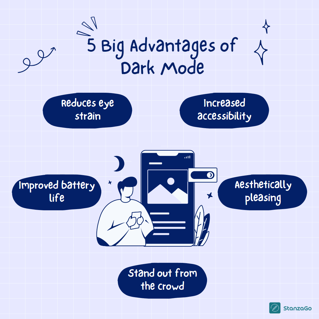
Dark mode, also known as night mode or dark theme, inverts the color scheme of a user interface, typically using darker backgrounds with lighter text and UI elements. This design approach not only looks sleek but can also provide several benefits:
- Reduced eye strain in low-light conditions
- Potential battery savings on OLED screens
- Improved readability for some users
- A modern and stylish aesthetic

Best Practices for Dark Mode Web Design Implementation
1. Use System Preferences
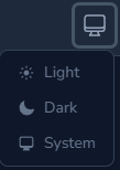
One of the most user-friendly approaches to dark mode implementation is respecting the user’s system preferences. Modern operating systems offer a system-wide dark mode setting, and browsers can detect this preference.
To implement this in CSS, use the prefers-color-scheme media query:
@media (prefers-color-scheme: dark) {

/* Dark mode styles */

}
This ensures that your website automatically switches to dark mode when the user has enabled it system-wide.
2. Provide a Manual Toggle
While respecting system preferences is important, it’s also beneficial to provide a manual toggle for users who want to switch modes independently of their system settings.

Implement a toggle switch in your UI and use JavaScript to apply the appropriate CSS classes or data attributes to your <html> or <body> tag:
const toggleSwitch = document.querySelector('#dark-mode-toggle');

toggleSwitch.addEventListener('change', switchTheme);
function switchTheme(e) {

if (e.target.checked) {

document.documentElement.setAttribute('data-theme', 'dark');

} else {

document.documentElement.setAttribute('data-theme', 'light');

}

}
3. Use CSS Custom Properties (Variables)
CSS Custom Properties make it easier to manage color schemes across your entire site. Define a set of variables for both light and dark modes:
#
:root {

--background-color: #ffffff;

--text-color: #333333;

/* Other light mode variables */

}
[data-theme="dark"] {

--background-color: #333333;

--text-color: #ffffff;

/* Other dark mode variables */

}
Then use these variables throughout your CSS:
body {

background-color: var(--background-color);

color: var(--text-color);

}
This approach centralizes your color management and makes it easier to maintain consistency across your site.
4. Consider Color Contrast
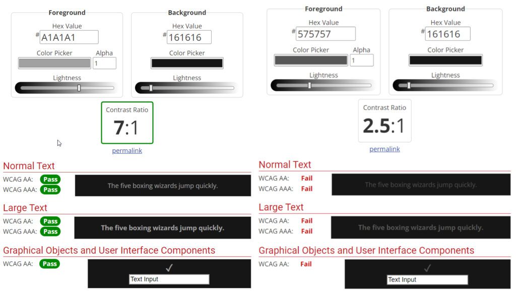
Ensure that your dark mode color scheme maintains sufficient contrast for readability. The Web Content Accessibility Guidelines (WCAG) recommend a minimum contrast ratio of 4.5:1 for normal text and 3:1 for large text.

Use tools like the WebAIM Contrast Checker to verify your color combinations meet these standards.
5. Adjust Image and Media Content
Don’t forget about images and other media when implementing dark mode. For images with transparent backgrounds, consider using CSS filters to adjust their brightness and contrast:
[data-theme="dark"] img {

filter: brightness(.8) contrast(1.2);

}
For essential UI elements, consider providing separate dark mode versions of logos or icons.
6. Be Mindful of Shadows and Depth
In dark mode, traditional box-shadows may not be as effective in conveying depth. Consider using lighter shadows or alternative methods like subtle background color changes to indicate elevation:
[data-theme="dark"] .card {

box-shadow: 0 1px 2px 0 rgba(255, 255, 255, 0.05);

background-color: #424242;

}
7. Smooth Transitions
To enhance user experience, add smooth transitions when switching between light and dark modes:
body {

transition: background-color 0.3s ease, color 0.3s ease;

}
Be cautious not to overuse transitions, as they can cause performance issues on less powerful devices.
Considerations for Dark Mode Implementation
1. Performance Impact
While dark mode can potentially save battery life on OLED screens, the implementation itself shouldn’t negatively impact your site’s performance. Be mindful of the number of CSS rules and transitions you’re adding.
2. Testing Across Devices and Browsers
Ensure your dark mode implementation works consistently across different devices and browsers. Pay special attention to older browsers that may not support prefers-color-scheme or CSS Custom Properties.
3. User Preferences Persistence
Consider using local storage or cookies to remember a user’s mode preference across sessions:
function setThemePreference(theme) {

localStorage.setItem('theme', theme);

document.documentElement.setAttribute('data-theme', theme);

}
4. Content Readability
While dark mode can reduce eye strain, long-form text can sometimes be harder to read on dark backgrounds. Consider offering additional typography adjustments for dark mode, such as slightly increased font weight or letter spacing.
5. Brand Consistency
Ensure your dark mode design aligns with your brand guidelines. You may need to adjust your color palette to maintain brand recognition while still providing an effective dark mode experience.
Conclusion
Implementing dark mode in web design is more than just inverting colors. It requires thoughtful consideration of user preferences, accessibility, performance, and design consistency. By following these best practices and keeping these considerations in mind, you can create a dark mode experience that enhances your website’s usability and aesthetic appeal.
Remember, the goal of dark mode is to improve user experience. Always test your implementation with real users and be open to adjustments based on feedback. With careful planning and execution, dark mode can be a valuable addition to your web design toolkit.